Most digital contracts are designed like the internet never happened.
We live in a world where marketing teams optimise every step of attention: landing pages, onboarding flows, pricing pages, emails, even button copy. We use data, experiments, and user testing to turn confusion into clarity.
And then we hand someone a contract that looks like a wall of text and act surprised when they don’t read it.
This is a contract communication problem, a contract user experience problem, and ultimately a contract transparency problem. If agreements are supposed to help people make decisions, then it’s time to build modern contracts the way we build modern everything else: for real human behaviour.
What this blog contains
- The uncomfortable truth
- What marketing got right (and contracts didn’t)
- The behavioural reality we ignore
- How to fix it: legal document design for engagement
- Why this matters: informed decision making
- The bigger question
- Links and further reading
The uncomfortable truth
Marketing evolved because people stopped paying attention. Contracts didn’t. That’s the uncomfortable truth: we have normalised disengagement in agreements. In most organisations, if customers ignore an email, that’s a problem to solve. If users bounce from a page, we redesign it. If onboarding drops off, we run tests.
But if someone signs a contract without reading it, we treat it as “just how it is”. The irony is that agreements are often the highest-stakes communications in a customer journey. They govern cost, renewal, cancellation, liability, risk, responsibility, and outcomes. They shape whether a relationship feels fair when something goes wrong.
So if we care about customer experience, why is the contract experience so often the most neglected? It’s not because we lack the tools. It’s because contracts historically optimise for defensibility, not understanding. They are built to withstand worst-case scenarios, not to perform in real-world decision making.
But contract transparency is not in tension with defensibility. In many cases it strengthens it. Clarity reduces disputes, reduces “surprise”, and reduces the gap between what a business believes it said and what a customer believes they heard.
What marketing got right (and contracts didn’t)
Marketing is fundamentally the discipline of getting someone from “I’m not thinking about this” to “I understand enough to act.”. Contracts are supposed to do something similar: help someone understand what they’re agreeing to before they commit. So what did marketing learn that agreements still resist?
Simplicity drives action (and comprehension)
Marketing teams assume the reader is busy, distracted, and scanning. They design for that reality. Most contracts still assume the reader is calm, focused, and reading like it’s an exam.
In practice, people engage with agreements at the worst possible time: they want to finish checkout, complete onboarding, get keys, start a service, submit a claim, or close the deal. The contract is friction standing between them and their goal. So if you want contract engagement, you can’t rely on goodwill. You have to earn attention with structure, clarity, and relevance.
Marketing does this through:
-
Clear hierarchy: headings that mean something, not “Miscellaneous”.
-
Front-loading: putting the point first, not after three pages of background.
-
Short sentences and plain words.
-
Progressive disclosure: a scannable summary first, details later.
This isn’t about “dumbing down”. It’s about designing information so a non-expert can correctly understand it.
Meet people where they are (and how they learn)
Marketing moved from brochures to mobile-first content. From long copy to short-form formats. From single-channel campaigns to multi-format messaging. Contracts largely stayed:
-
Dense
-
Text-heavy
-
Linear
But modern communication isn’t linear. People learn through a mix of:
-
Skimming (finding the bits that matter)
-
Visual cues (structure, layout, emphasis)
-
Audio and video (especially for high-stakes or complex decisions)
-
Interaction (being asked to confirm understanding, not just to “tick the box”)
In other words: agreements should adopt the same principle marketing adopts—use the formats people actually use.
Marketing tests. Contracts freeze.
Marketing assumes messaging is always improvable. Contracts often freeze language for years because “that’s the template”. But if you care about customer experience in contracts, you need a feedback loop:
-
Where do customers get confused?
-
Which terms create the most complaints?
-
Which sections lead to support tickets or cancellations?
-
What do people misremember later?
Marketing teams track drop-off and optimise. Contract teams can do the same: measure comprehension, track friction, and improve what’s unclear.
The behavioural reality we ignore
Here’s the part most people know intuitively but rarely say out loud in legal teams:
Most people do not read full contracts.
Even when people open the document, they scan. Even when they scan, they miss important terms. And even when they “agree”, it often isn’t because they made a fully informed choice—it’s because they wanted to move forward. This is not a moral failure. It’s a design reality. We also underestimate how extreme the time mismatch is. The average person cannot realistically read every policy, every set of terms, and every privacy notice they encounter online. Nobody has the time. So people take shortcuts. They rely on brand trust, social norms (“everyone does this”), and assumptions (“it’ll be fine”). They assume important terms will be reasonable, because they have no practical way to evaluate every clause. Contracts, meanwhile, often respond by adding more: more clauses, more carve-outs, more edge cases. That approach can increase legal coverage while decreasing human comprehension.
And here’s the core problem:
We designed around legal protection rather than human understanding.
Marketing optimises for engagement and comprehension. Legal documents optimise for enforceability. But those goals don’t have to fight. You can design for understanding and keep a robust legal foundation. In many situations, improving clarity and prominence actually reduces enforcement risk because fewer people can credibly argue they were surprised, misled, or not given a fair chance to understand.
How to fix it: legal document design for engagement
If your goal is to simplify legal documents without losing legal meaning, the fix is not “make it shorter” as a blanket rule. The fix is: make it usable. Think of this as legal document design and contract user experience, not just drafting.
Start with a decision summary (not a table of contents)
People don’t need a contents page first. They need a “what am I agreeing to?” view. A strong summary does three jobs:
-
Orientation: what this agreement is for and what happens after acceptance.
-
Material terms: the few terms that change real outcomes (money, time, data, rights, recourse).
-
Where to look: direct readers to relevant detail if they want to go deeper.
One practical approach: a “Key Facts” section (like a product facts panel) that includes:
-
Price and payment timing
-
Renewal and cancellation
-
Cooling-off / refund position (where relevant)
-
Key obligations (e.g., minimum term, usage limits, notice periods)
-
Important exclusions (what’s not included)
-
Data use and sharing (where relevant)
-
What happens if something goes wrong (complaints / dispute steps)
If you only improve one thing for contract transparency, make it this.
Layer the details so people can choose depth
Contracts are not “one reading level”. They have multiple audiences:
-
A customer who wants the basics
-
A procurement team who wants risk detail
-
A lawyer who wants full drafting
Layering lets you provide:
-
Level 1: a summary you can scan in under a minute
-
Level 2: plain-language explanations of key clauses
-
Level 3: full legal text for completeness
This is normal in modern product UX. We don’t put every setting on the home screen; we put the essentials first and let users expand into detail. Agreements can do the same.
Use just-in-time explanations at the moment of choice
Some terms are not “read once and understood forever” terms. They are “this matters when you do X” terms. Examples include:
-
Auto-renewal matters when someone starts a trial or upgrades.
-
Cancellation fees matter when someone tries to cancel.
-
Liability limitations matter when a claim happens.
-
Data-sharing matters when consent is requested or settings are changed.
Marketing already does this through onboarding prompts and tooltips. Contracts can do it through contract communication that appears when it’s most relevant, not buried in the document. This shift is subtle but powerful: you stop assuming attention is unlimited, and you start delivering information when it’s actually usable.
Standardise the way you present the most important terms
If every contract presents key terms differently, readers have to relearn the “interface” every time. That’s cognitive load you created. Standardisation is why nutrition labels work. It’s why pricing tables work. It’s why onboarding checklists work.
For contracts, standardisation can look like:
-
A consistent “Key Facts” panel across your products
-
A consistent structure for fees, renewals, cancellation, and obligations
-
Icons or labels that help people quickly identify risk areas
This is not about marketing gloss. It’s about reducing the effort cost of understanding.
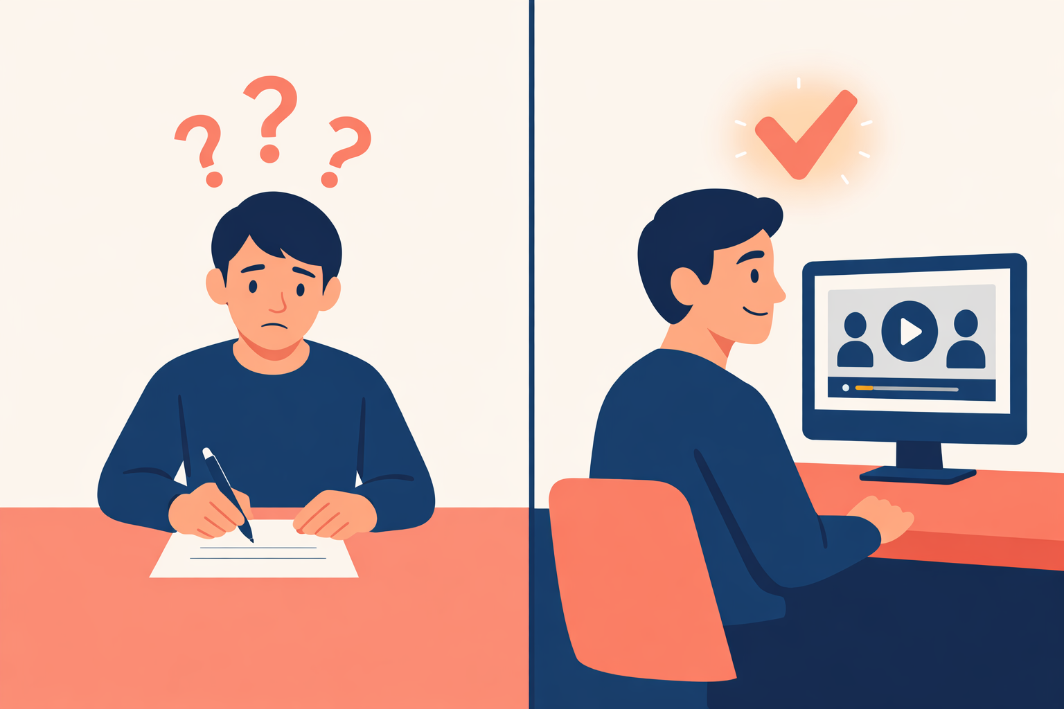
Use audio and video with intent (not as decoration)
Adding a video “because video is popular” isn’t the point. The point is to use formats that help different people understand. For some users, a short explanation of the 5–7 most consequential terms will create more clarity than 15 pages of dense text.
In practice, that can include:
-
A 60–120 second video summary covering the key facts and the biggest risks
-
An audio walkthrough for accessibility and preference
-
A short “what happens if…” explainer for common scenarios (cancellation, non-payment, disputes)
Importantly: the best versions of this don’t replace the contract. They make the contract understandable.
Change the call to action: not just “sign here”
Today’s default interaction is: “scroll, tick, accept.” That’s a signature ritual, not informed agreement. Instead, design acceptance as a moment of understanding. That can include:
-
Specific acknowledgements of key terms (e.g., renewal, cancellation, key exclusions)
-
Comprehension checks for truly high-stakes terms (simple, non-patronising)
-
A record of what was shown at the point of acceptance (summary + full text version)
This is where contract engagement becomes measurable: you can show that people saw and acknowledged what mattered, not just that they clicked a button.
Treat the contract as part of the customer journey
Marketing doesn’t end at conversion. It continues through onboarding, reminders, retention, and support. Most contracts disappear the moment they are signed—until there’s a complaint. Simple fixes here include:
-
A “welcome” message that restates key terms in plain language
-
Renewal reminders that are actually meaningful (not buried or vague)
-
Clear pathways to ask questions and get clarification
This is customer experience in contracts in practice: using communication to keep expectations aligned across time, not just at signing.
Why this matters: informed decision making
Agreements are not just documents. They are moments of decision.
If someone does not understand:
-
The risk
-
The obligations
-
The consequences
…then the system is failing.
There are also practical consequences for businesses:
-
Disputes rise when outcomes differ from expectations.
-
Complaints rise when customers feel surprised, rushed, or misled.
-
Support load rises when contracts don’t do their job as communication.
-
Trust erodes when “fine print” feels like a trap.
In a world of increasing focus on transparency, fairness, and consumer understanding, contract transparency is quickly becoming a competitive advantage. People remember how you made them feel at the moment they committed. If your agreement experience feels clear and human, you build trust. If it feels like a trick, you build churn. This is why improving contracts is not just a legal exercise. It’s a business communication exercise. It’s part of customer experience design.
The bigger question
If marketing has spent decades learning how humans actually consume information, why is law still acting as if people read like lawyers? And a more practical question:
What would change if we treated agreements like a product surface?
-
Would we user-test contracts the way we user-test onboarding?
-
Would we measure comprehension, not just completion?
-
Would we design for accessibility from the start?
-
Would we treat “surprise” as a design failure?
Next generation expectations
One more thing: new generations are growing up in a multi-format world. They expect explanations, not walls of text. They consume information through:
-
Short-form video
-
Voice notes and audio
-
Structured summaries
Businesses adapted marketing to match that shift. Agreements will have to adapt too. The future doesn’t belong to the longest contract. It belongs to the clearest one.
Links and further reading
Internal links
- I agree – Informed consent: understanding beyond signatures
- I agree – How it works
- I agree – Our principles
- I agree – Reduce complaints and disputes through clearer agreements
- I agree – Context contracts: keeping the “journey to consent”
- I agree – Future of agreements with voice and video consent in the UK
External links
- European Commission – Study on consumers’ attitudes towards terms and conditions (evidence on low readership and acceptance behaviour)
- UK Government / Behavioural Insights Team – Literature review on improving comprehension of online contractual terms and privacy policies
- Obar & Oeldorf-Hirsch – “The Biggest Lie on the Internet” (terms/privacy reading behaviour experiment)
- McDonald & Cranor – “The Cost of Reading Privacy Policies” (time and economic cost estimates)
- Nielsen Norman Group – How users read on the web (scanning behaviour and writing guidance)
- Nielsen Norman Group – How little users read (estimated proportion of text read and time on page)
- Nielsen Norman Group – F-shaped pattern of reading (how people scan content)
- ICO – Right to be informed (clear and plain language, layering, dashboards, just-in-time notices, user testing)
- UK Competition and Markets Authority – Unfair contract terms explained (transparency and prominence concepts)
- Martínez et al. (2023) – “Even lawyers do not like legalese” (comprehension and enforceability perceptions with simplified drafting)
- JMIR – Systematic review on eConsent vs paper consent (comparative evidence on understanding and usability)
- Kelley et al. (2009) – “A Nutrition Label for Privacy” (standardised format to improve information finding and comprehension)
- Business Disability Forum – Making the small print accessible (accessibility and inclusive communication guidance)
- Murray (2021 reprint) – Cartoon contracts and visualisation of law (how visual formats can improve accessibility)