What is contract comprehension and why does it matter
Future of agreements
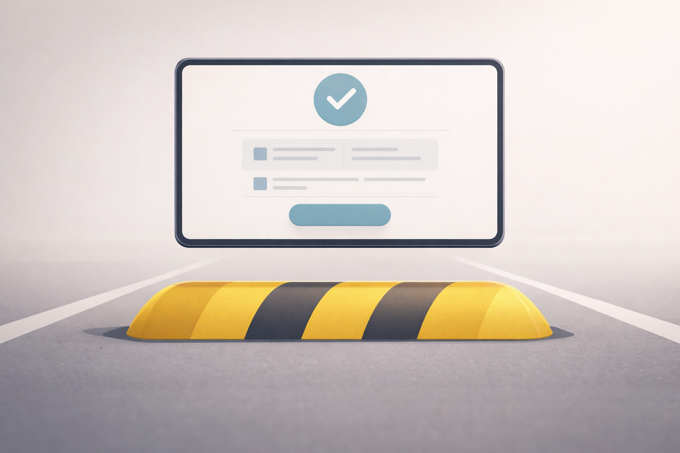
Informed Consent
Understanding
12/05/2026
11 min read

03 March 2025
7 min read

Good UI/UX design is about making digital experiences intuitive, efficient, and enjoyable. It focuses on how users interact with a product, ensuring that navigation of products feels natural, information is easy to digest, and functions seamlessly. Strong UX design prioritises usability, accessibility, and clarity, while UI design enhances the experience with visually appealing and functional interfaces.
UI/UX refers to User Interface and User Experiences. These are terms focused primarily on giving end-users (such as you or I) a positive experience when navigating a website or online platform. UI refers to the design and layout, meaning the platform organised in manageable and aesthetically pleasing structures. UX refers to whether navigating the platform is simple, understandable, and easy to use for the end user.
If a user experiences a high level of both UI/UX, they are likely to be more engaged and rate their experience as positive overall. So if this is true with platforms... Why isn’t it a major focus with contract providers?
UI design is all about how a product looks and feels. It focuses on creating visually appealing, functional, and accessible interfaces that enhance user interaction. UI is crucial when it comes to aesthetic. It’s known that a visually pleasing UI platform people often place a “Halo”. This is known as the Halo Effect by which, even if people aren't able to complete their tasks on a platform, they still rate experience as positive as it was visually pleasing to use. UI is directly based in scientific theory, to name a few:
Visual Hierarchy: Size and Weight: Larger and bolder parts attract more attention. This is based on Gestalt Principles which is based on proximity, similarity, and figure-ground, and aims to explain how users perceive and group interface elements.
Consistency and Familiarity: This is a focus on colour, typography, icons and structure. This is based on Jakobs law which focuses on interfaces that work similarly to those they are already familiar with. This means borrowing patterns from widely used platforms improves usability.
Colour theory and accessibility: Colour is a powerful tool for branding, emotion, and usability.
A good UX design ensures that users can achieve their goals quickly and efficiently without confusion or frustration. UX heavily focuses on making sure that overall, the user experience is positive. Often, when a platforms experience is rated as overall positive, then users/customers are more likely to return and commit to repeat use.
Usability and simplicity: UX design should simplify choices and guide users towards their goals. This relates closely to Jakobs law outlined previously.
Cognitive load and decision making: Users should not feel overwhelmed when interacting with a product. UX design should simplify choices and guide users towards their goals. This relates to Hicks Theory, whereby the more choices a user has, the longer it takes to make a decision. Reducing options improves efficiency.
Emotional design and engagement: Great UX goes beyond function and taps into human emotions. Users should not only be able to complete tasks but also feel good while doing so. This relates to the Peak End Rule, where people judge an experience based on the peak of their interaction this then ensure a positive interaction, especially at key moments, leaving a lasting impression. Key parts of this design theory is focusing on:
The way a platform is designed has a direct impact on how customers feel, behave, and engage with it. A well-crafted UI can create a sense of trust, while a poorly designed experience can lead to frustration and abandonment. From the moment a customer lands on a website or opens an app, their initial reaction is shaped by the visual design, and overall usability.
Research supports the idea that customers form opinions about digital platforms almost instantly. A study by Lindgaard et al. (2006) found that people make judgments about website aesthetics in just 50 milliseconds. This means that before a user has even begun to engage with content, their perception of a platform is already being shaped by its how it looks. If a platform fails to follow any of the mentioned characteristics from earlier, then it automatically means that your platform will have negative connotations attributed by your customers.
Beyond first impressions, the usability of a platform influences how users feel during interactions. A study by Tuch et al. (2012) demonstrated that aesthetically pleasing platforms are often perceived as more usable, even if functionality remains unchanged. This aligns with the concept of the Aesthetic-Usability Effect, where users tend to forgive minor usability flaws if a platform is aesthetically appealing. However, if a platform is both unattractive and difficult to use, frustration builds, resulting in a negative emotional response and 'abandonment’ of said platform.
Emotional reactions to platforms are also shaped by responsiveness and feedback mechanisms. The Doherty Threshold, a principle in UX design, suggests that users feel more engaged when a system responds within 400 milliseconds. Studies by Nielsen Norman Group have shown that delays beyond this threshold implies ‘slowness’, which leads to frustration and reduced user satisfaction. Platforms that provide instant feedback through animations, loading indicators, and interactive elements create a sense of fluidity and control, making users feel more connected to the experience.
Trust is another crucial factor influenced by UI/UX design. A study by Fogg et al. (2003) on Web Credibility found that users judge a website’s trustworthiness based on visual design as much as its content. Clean layouts, typography, and consistent branding all contribute to a sense of reliability. On the other hand, inconsistent design, pop-up overload, and confusing navigation patterns can make users sceptical, reducing engagement.
UI/UX design plays a crucial role in guiding users toward completing a purchase by reducing friction and creating a seamless, intuitive journey. Well-placed call-to-action buttons, clear product descriptions, and a smooth checkout process all contribute to higher conversion rates. A study by Baymard Institute found that nearly 70 percent of online shopping carts are abandoned, often due to confusing layouts, hidden costs, or overly complicated forms. By implementing clear progress indicators, autofill options, and trust signals such as security badges, platforms can reduce hesitation and make users feel more confident in their purchase decisions.
Ultimately, UI/UX design does more than just make platforms look attractive. It shapes user emotions, builds trust, and influences decision making. Whether users feel engaged, frustrated, or indifferent often comes down to the thoughtfulness behind the design. By applying key principles and prioritising intuitive experiences, designers can create platforms that encourage positive interactions and long-term engagement.
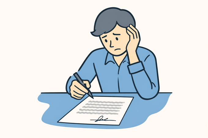
Contracts are meant to create clarity, yet for most people, they do the exact opposite. Whether it is a business agreement, employment contract, or terms and conditions, many of us have signed documents we barely understood.
The reason? Contracts are not designed with the user in mind. They are often complex, difficult to navigate, and full of legal jargon that makes them feel more like an obstacle than a tool for clear communication.
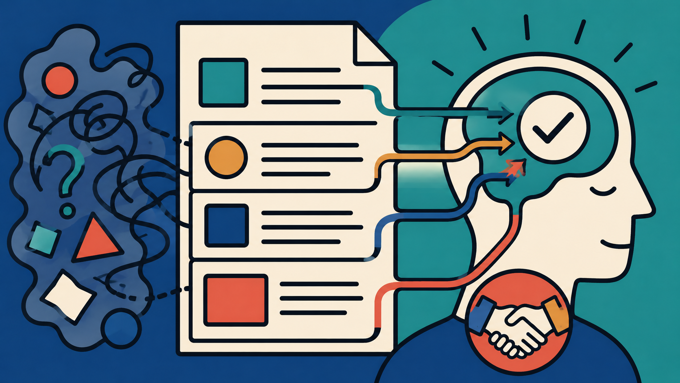
Great UX/UI design is not just about aesthetics. It is about making information accessible, intuitive, and easy to engage with. When applied to contracts, it can completely change how people interact with agreements, ensuring they are understood rather than just signed.
When contracts are designed with usability in mind, they reduce confusion and prevent disputes. They help users make more informed decisions. They improve compliance and reduce legal risks. They increase transparency and build trust in business relationships.
At ![]() i agree , we believe that agreements should empower users, not overwhelm them. By rethinking the UI/UX of agreements, we can create a document that simplifies a customer's obligations, and notifications in a much simpler way that works cohesively with how our brains function and engage with information which we discussed in one of our previous posts. (Give it a read, go on engage with it.) We are making sure people do not just sign agreements but understand them. Regulatory bodies such as the FCA, SRA and the GMC are putting a large focus on how agreements are solicited and completed. The biggest concern is whether a contract can actually provide genuine Informed Consent. From our perspective they don’t, modern contracts don’t engage customers with its content, and a large part of this is the UI/UX fundamentals that are embedded in it. However, i agree makes sure that we present information simply, offer you all critical information, and guarantee that we offer informed consent, with our new innovative platform revolutionise your agreement process. To protect you, or your business, we offer something for everyone.
i agree , we believe that agreements should empower users, not overwhelm them. By rethinking the UI/UX of agreements, we can create a document that simplifies a customer's obligations, and notifications in a much simpler way that works cohesively with how our brains function and engage with information which we discussed in one of our previous posts. (Give it a read, go on engage with it.) We are making sure people do not just sign agreements but understand them. Regulatory bodies such as the FCA, SRA and the GMC are putting a large focus on how agreements are solicited and completed. The biggest concern is whether a contract can actually provide genuine Informed Consent. From our perspective they don’t, modern contracts don’t engage customers with its content, and a large part of this is the UI/UX fundamentals that are embedded in it. However, i agree makes sure that we present information simply, offer you all critical information, and guarantee that we offer informed consent, with our new innovative platform revolutionise your agreement process. To protect you, or your business, we offer something for everyone.
UI refers to how a platform looks, including layout, colours, and visual elements. UX focuses on how it works, ensuring users can navigate easily and achieve their goals without confusion. Together, they create an experience that feels both intuitive and enjoyable.
Good UI/UX improves engagement, builds trust, and makes tasks easier to complete. Users form opinions in milliseconds, so a clear and attractive design encourages them to stay, interact, and return. Poor design leads to frustration, confusion, and often abandonment.
Design directly influences how users feel and act. Clear layouts and fast responses create confidence, while cluttered or slow systems cause frustration. Principles like visual hierarchy and cognitive load help guide decisions, making users more likely to complete actions successfully.
Most contracts prioritise legal protection over usability. They are often long, complex, and full of jargon, making them hard to read and understand. This leads users to skim or skip them entirely, creating a gap between agreement and actual understanding.
Applying UI/UX principles makes contracts clearer and more engaging. This includes using plain language, breaking content into sections, highlighting key terms, and adding visual or interactive elements. These changes help users understand what they are agreeing to, reducing confusion and disputes.
Improved contract design reduces misunderstandings, lowers complaint volumes, and builds trust with users. It also supports compliance by demonstrating clarity and informed consent. Ultimately, better UX turns contracts into tools for communication rather than barriers to understanding.